Penguicon Mascot
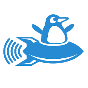
Aug. 31st, 2011 12:54 pmDisclaimer: I'm just engaging in a thought experiment here, to practice my skills. I'm not saying we should change. A few years back, some people decided to make an official Penguicon logo, and spent a lot of money to print it on window clings. They're committed to follow through on that investment to consistently associate our convention with that logo. The conchair confirmed it was too soon for an update. What's done is done, so that's that. Here is the official logo they made:

Thus endeth the disclaimer. Anyway, while making the new Penguicon website, I got to thinking about the differences between a logo, a logotype, and a mascot. The Disney logotype is the name in Walt Disney's distinctive handwriting. The Disney logo is three circles. It could almost be considered a new punctuation mark. The Disney mascot is Mickey Mouse himself, usually as either a costume or an illustration.
Very few successful logos are illustrations. (Oddly, many outdoorsman supply stores are exceptions to this rule, with detailed illustrations of a fish or duck.) The idea of our window clings was inspired by the window clings of TMBO. Their logo is a plus sign inside two brackets, easily recognizable on a car window as it drives by at thirty miles an hour. Most logos are intended to be printed (or even embroidered) on all kinds of items, so they need to be recognizable in only one color.
Consider the various logos Doubletree Hotel has had. Some are so simplistic they could count as a newly-invented punctuation mark (an ideal quality in a logo, for some purposes). When they draw one or more trees, they use fine-grained complexity, but the eye does not have to pick out any detail like a penguin flipper or tiny stars. It just gives a gestalt impression of an object we are all trained to recognize in a flash. The logotype, when included with the logo as one piece, is large enough to take prominence.
So, I fooled around with a less-detailed version of the logo, so it would be more recognizable on a car window at a distance, and would be legible in a tiny favicon on a browser title bar, and so forth. This was what I came up with.

I realized this looked too professional. It doesn't look fun. I talked it over with![[livejournal.com profile]](https://www.dreamwidth.org/img/external/lj-userinfo.gif) atdt1991, who designed the official logo. He said the penguin in the logo has facial features
atdt1991, who designed the official logo. He said the penguin in the logo has facial features
because we want it to be expressive and have a personality. So I tried this:
This one doesn't work either. It seems like a child's squeaky toy.
So I got to thinking about what kind of personality we actually want. Basically nerdy, fun, happy, energetic, and maybe even a little bit up to no good (attributes which the Linux mascot mostly lacks). Inspiration should come from trickster/clown archetypes such as Ananse, Coyote, Reynard the Fox, and Bugs Bunny. Here it is:

Thus endeth the disclaimer. Anyway, while making the new Penguicon website, I got to thinking about the differences between a logo, a logotype, and a mascot. The Disney logotype is the name in Walt Disney's distinctive handwriting. The Disney logo is three circles. It could almost be considered a new punctuation mark. The Disney mascot is Mickey Mouse himself, usually as either a costume or an illustration.
Very few successful logos are illustrations. (Oddly, many outdoorsman supply stores are exceptions to this rule, with detailed illustrations of a fish or duck.) The idea of our window clings was inspired by the window clings of TMBO. Their logo is a plus sign inside two brackets, easily recognizable on a car window as it drives by at thirty miles an hour. Most logos are intended to be printed (or even embroidered) on all kinds of items, so they need to be recognizable in only one color.
Consider the various logos Doubletree Hotel has had. Some are so simplistic they could count as a newly-invented punctuation mark (an ideal quality in a logo, for some purposes). When they draw one or more trees, they use fine-grained complexity, but the eye does not have to pick out any detail like a penguin flipper or tiny stars. It just gives a gestalt impression of an object we are all trained to recognize in a flash. The logotype, when included with the logo as one piece, is large enough to take prominence.
So, I fooled around with a less-detailed version of the logo, so it would be more recognizable on a car window at a distance, and would be legible in a tiny favicon on a browser title bar, and so forth. This was what I came up with.
I realized this looked too professional. It doesn't look fun. I talked it over with
because we want it to be expressive and have a personality. So I tried this:
This one doesn't work either. It seems like a child's squeaky toy.
So I got to thinking about what kind of personality we actually want. Basically nerdy, fun, happy, energetic, and maybe even a little bit up to no good (attributes which the Linux mascot mostly lacks). Inspiration should come from trickster/clown archetypes such as Ananse, Coyote, Reynard the Fox, and Bugs Bunny. Here it is:
no subject
Date: 2011-09-01 02:38 pm (UTC)Also, it's telling that from a wide array of potential logo choices out there, you selected to discuss those that most reinforced your view rather than those whose marketing goals most resembles Penguicon's (brand awareness and affinity...like NASA's 90's campaign, the World Wildlife Foundation, Fruit of the Loom, and the Phoenix Suns, for examples)
You confuse 'something pretty that you like' with 'contributing to an overall effect and goal'. Given your disdain for marketing, this is unsurprising.
no subject
Date: 2011-09-01 03:19 pm (UTC)I think we agree more than you might suspect. The World Wildlife Foundation's panda logo, even though it represents a physical object, is an example of the un-detailed type of logo I am describing.
In all three cases, the logotype (when included) is large enough to share visual dominance.
I would like to approach this topic as someone who would like to learn from someone with a lot of professional experience in marketing. My questions are not rhetorical-- I want to know. What other goals are there to a logo besides brand awareness and affinity? And how does the detail and multiple colors in the Fruit of the Loom illustration accomplish brand awareness and affinity, while the style used in most logos matches other logo goals?
no subject
Date: 2011-09-01 04:55 pm (UTC)A better question is, “What other goals are there to a marketing campaign other than brand awareness and affinity?” A logo is merely a piece in the marketing campaign puzzle. The answer, however, is virtually limitless: you could have a campaign focused on virtually anything that is important to your promotion of the product.
None of this is particularly easily explained in a brief message on the Internet, sadly. Hell, much of it I don't even entirely grasp. Some of it is psychology, some of it is even more esoteric than that...and a ton is gut feel.
no subject
Date: 2011-09-02 01:37 am (UTC)the 'too-professional' one is my favorite.
the squeaky-toy one is very cute.
not a fan of the last one.
no subject
Date: 2011-09-04 02:37 pm (UTC)The second is better, if a bit whimsical. Though the penguin's expression seems more like panic. I'd suggest dropping the penguin's back flipper and making the front flipper and beak horizontal. I think it would give it a lot more sense of purposeful movement. Also, this design could easily be adapted to be a wifi signal strength indicator.
The third is childish, like what one might see on Nickelodeon. Fun, probably, but no sense of purpose or style.
Part of the question you should be asking is, what does the original logo express, and how do the various elements of that logo help it do that? To me, it expresses a dream. That's a penguin that's going places. There are four elements to the logo: a penguin, a rocketship, stars, and a border. And that's what it shows, a penguin flying a rocket among the stars. The border helps offset it from the real world, makes it like a window to that other world. Take away the border, and it wouldn't be as good. You wouldn't be able to have the stars, and the stars add more to it than you might think.
no subject
Date: 2011-09-04 05:26 pm (UTC)