Penguicon Mascot
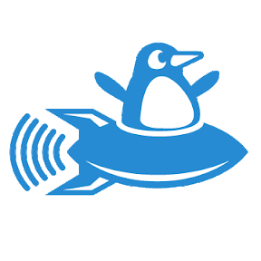
Aug. 31st, 2011 12:54 pmDisclaimer: I'm just engaging in a thought experiment here, to practice my skills. I'm not saying we should change. A few years back, some people decided to make an official Penguicon logo, and spent a lot of money to print it on window clings. They're committed to follow through on that investment to consistently associate our convention with that logo. The conchair confirmed it was too soon for an update. What's done is done, so that's that. Here is the official logo they made:

Thus endeth the disclaimer. Anyway, while making the new Penguicon website, I got to thinking about the differences between a logo, a logotype, and a mascot. The Disney logotype is the name in Walt Disney's distinctive handwriting. The Disney logo is three circles. It could almost be considered a new punctuation mark. The Disney mascot is Mickey Mouse himself, usually as either a costume or an illustration.
Very few successful logos are illustrations. (Oddly, many outdoorsman supply stores are exceptions to this rule, with detailed illustrations of a fish or duck.) The idea of our window clings was inspired by the window clings of TMBO. Their logo is a plus sign inside two brackets, easily recognizable on a car window as it drives by at thirty miles an hour. Most logos are intended to be printed (or even embroidered) on all kinds of items, so they need to be recognizable in only one color.
Consider the various logos Doubletree Hotel has had. Some are so simplistic they could count as a newly-invented punctuation mark (an ideal quality in a logo, for some purposes). When they draw one or more trees, they use fine-grained complexity, but the eye does not have to pick out any detail like a penguin flipper or tiny stars. It just gives a gestalt impression of an object we are all trained to recognize in a flash. The logotype, when included with the logo as one piece, is large enough to take prominence.
So, I fooled around with a less-detailed version of the logo, so it would be more recognizable on a car window at a distance, and would be legible in a tiny favicon on a browser title bar, and so forth. This was what I came up with.

I realized this looked too professional. It doesn't look fun. I talked it over with![[livejournal.com profile]](https://www.dreamwidth.org/img/external/lj-userinfo.gif) atdt1991, who designed the official logo. He said the penguin in the logo has facial features
atdt1991, who designed the official logo. He said the penguin in the logo has facial features
because we want it to be expressive and have a personality. So I tried this:
This one doesn't work either. It seems like a child's squeaky toy.
So I got to thinking about what kind of personality we actually want. Basically nerdy, fun, happy, energetic, and maybe even a little bit up to no good (attributes which the Linux mascot mostly lacks). Inspiration should come from trickster/clown archetypes such as Ananse, Coyote, Reynard the Fox, and Bugs Bunny. Here it is:

Thus endeth the disclaimer. Anyway, while making the new Penguicon website, I got to thinking about the differences between a logo, a logotype, and a mascot. The Disney logotype is the name in Walt Disney's distinctive handwriting. The Disney logo is three circles. It could almost be considered a new punctuation mark. The Disney mascot is Mickey Mouse himself, usually as either a costume or an illustration.
Very few successful logos are illustrations. (Oddly, many outdoorsman supply stores are exceptions to this rule, with detailed illustrations of a fish or duck.) The idea of our window clings was inspired by the window clings of TMBO. Their logo is a plus sign inside two brackets, easily recognizable on a car window as it drives by at thirty miles an hour. Most logos are intended to be printed (or even embroidered) on all kinds of items, so they need to be recognizable in only one color.
Consider the various logos Doubletree Hotel has had. Some are so simplistic they could count as a newly-invented punctuation mark (an ideal quality in a logo, for some purposes). When they draw one or more trees, they use fine-grained complexity, but the eye does not have to pick out any detail like a penguin flipper or tiny stars. It just gives a gestalt impression of an object we are all trained to recognize in a flash. The logotype, when included with the logo as one piece, is large enough to take prominence.
So, I fooled around with a less-detailed version of the logo, so it would be more recognizable on a car window at a distance, and would be legible in a tiny favicon on a browser title bar, and so forth. This was what I came up with.
I realized this looked too professional. It doesn't look fun. I talked it over with
because we want it to be expressive and have a personality. So I tried this:
This one doesn't work either. It seems like a child's squeaky toy.
So I got to thinking about what kind of personality we actually want. Basically nerdy, fun, happy, energetic, and maybe even a little bit up to no good (attributes which the Linux mascot mostly lacks). Inspiration should come from trickster/clown archetypes such as Ananse, Coyote, Reynard the Fox, and Bugs Bunny. Here it is: